Style Guide · March 2026 · 6 min read
How to Style a Neutral Living Room Without It Looking Boring
The neutral living room is one of the hardest things to get right in interior design. Get the layers wrong and it looks like a show home — sterile, forgettable, soulless. Get them right and it's the most timeless room you'll ever sit in. Here's the difference.
Why neutral rooms fail
Most neutral rooms fail because they mistake 'neutral' for 'no colour'. The result is a room that reads as beige — not warm, not rich, not considered. Just beige.
A well-done neutral room is actually full of colour — it just operates in a very tight tonal range. The difference between a warm white wall, a stone linen sofa, a parchment wool throw, an oat boucle cushion, and a natural oak side table is significant. None of those are 'neutral' in the sense of absent. Each has warmth, undertone, and character. The skill is in how they sit together.
Building the tonal foundation
Start with walls and floor. If you have pale wood floors, warm whites and off-whites on the walls will harmonise naturally. If you have dark wood floors, you can go either lighter (creating contrast) or warmer (creating continuity).
Your sofa is the most important purchase in the room. In a neutral scheme, a stone linen, oat boucle, or warm beige upholstery will carry the room. The Muuto Outline Sofa (from €4,650) in Steelcut Trio is one of the best examples — the fabric is complex enough that it reads as warm without being colourful. At a more accessible price, the HAY Mags Soft in a sandy fabric covers the same ground.
The rug anchors the room and gives you the opportunity to introduce the most texture of any single object. A flat-woven jute — West Elm's Parana (from €199) or Ferm Living's Kelim Rug — reads as neutral while adding significant material interest.
Where the interest lives
In a neutral room, interest comes from three sources: texture, form, and a single point of contrast.
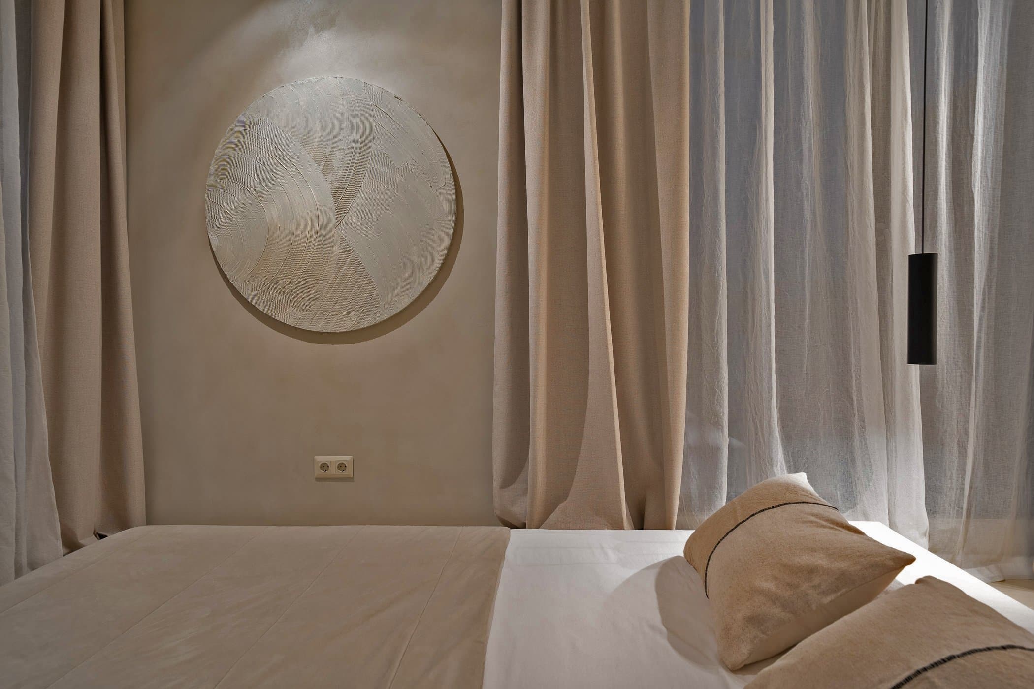
Texture is the primary tool. Boucle, linen, ribbed ceramic, woven rattan, smooth marble, rough stone — each of these is 'neutral' in colour but rich in surface. Layer them intentionally: a smooth ceramic vase against a textured linen cushion against an oiled wood side table.
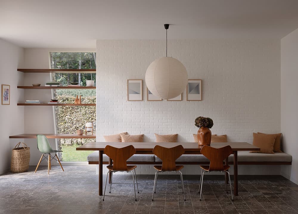
Form creates visual energy even in a quiet palette. An architecturally interesting pendant lamp — the Normann Copenhagen Studio pendant or the HAY Arcs Mirror — does more for a neutral room than any accent colour. The shape itself becomes the focal point.
For your single point of contrast, keep it small and considered. One dark green cushion, a single terracotta vase, a warm brass lamp base. The moment you add more than one accent, you're building a different kind of room — which is fine, but it's no longer neutral.
The common mistakes
Too much white: Pure white walls, white sofa, white rug — this isn't neutral, it's cold. Warm the base with off-whites and creams before adding anything else.
No dark anchors: Without something dark in the room — a coffee table in dark oak, a black pendant, a charcoal cushion — the room floats. Dark accents ground the space.
Ignoring scale: One large rug, one large piece of art, one statement light. In a neutral room, scale matters more than in a colourful one because there's nothing else to attract the eye.
Too many different woods: Pick one primary wood tone. Oak, walnut, or ebonised — commit to one and keep your secondary pieces either the same or in painted finishes.
The shopping list
For most neutral living rooms, the essential purchases in order of priority are: (1) a quality sofa in a warm neutral fabric, (2) a large natural fibre rug, (3) a statement pendant or floor lamp, (4) an oak or marble coffee table, (5) two or three textile layers — cushions and a throw — in complementary textures. Everything else is secondary.