Style Guide · May 2026 · 7 min read
The Complete Guide to Layering Textures in a Minimal Home
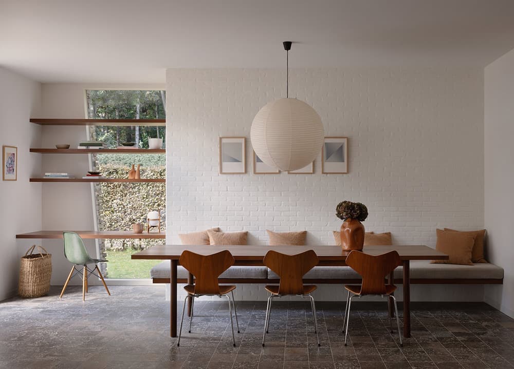
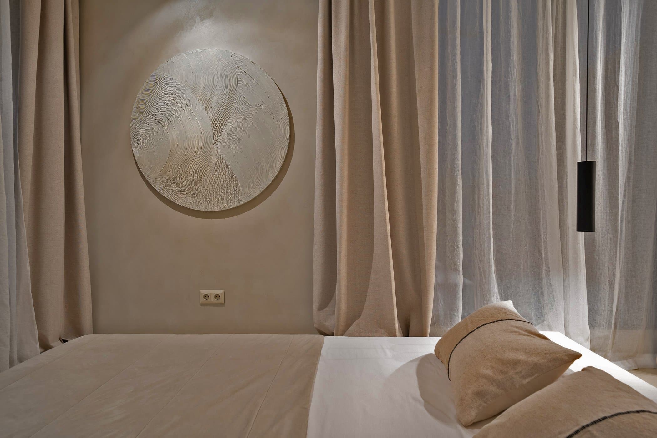
In a minimal room, texture does the work that colour does everywhere else. It's what stops a restrained palette from reading as cold, what gives a quiet space its warmth and personality. Here's how to layer it properly.
Why texture matters more than colour in minimal rooms
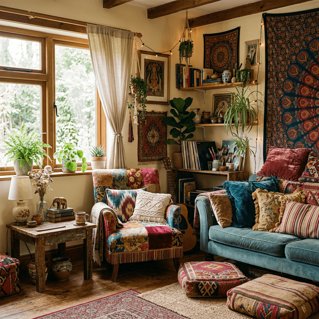
In a maximalist room, you can get away with a flat, textureless palette — the colour and pattern carry the space. In a minimal room, you have almost nothing to hide behind. Every surface is visible, every material is scrutinised.
Texture is how you make a minimal room feel rich rather than empty. The difference between a room with a smooth linen sofa and one with a boucle sofa, a wool throw, a jute rug, and a ribbed ceramic vase is enormous — even if they're in exactly the same colours. One feels considered. The other feels like a showroom.
The five-texture rule
A useful framework: aim for five distinct textures in any room. Not five different materials — five distinct tactile qualities. Smooth, rough, soft, woven, and hard is one version. Matte, sheen, nubby, flat-woven, and polished is another.
You don't need to introduce five separate objects. A boucle sofa already gives you two — the textured fabric and (usually) the piped or smooth trim. A jute rug is woven and rough at the same time. The framework is a mental check, not a shopping list.
The critical thing is contrast. Two soft textures together create less interest than one soft paired with one rough. A smooth marble side table next to a boucle cushion reads beautifully. Two boucle cushions together is just more of the same.
Layer by zone: floor to ceiling
Floor: The rug is your most powerful texture tool. A flat-woven jute or kelim rug grounds the room with significant material interest while reading as neutral. A deep-pile or shag rug adds softness but can overwhelm a minimal scheme — use them in bedrooms, not living rooms.
Seating: This is where most people over-smooth. A sofa in plain, flat linen is fine, but boucle, ribbed velvet, or a textured tweed mix brings far more to the room. The Muuto Outline Sofa in their Steelcut Trio wool fabric is a perfect example of what this means in practice.
Throws and cushions: Use these to introduce smaller quantities of contrast texture. A chunky knit throw on a linen sofa. A smooth silk cushion on a boucle armchair. The displacement between the main upholstery and the accessory is where the visual interest lives.
Surfaces: Ceramic, stone, rattan, and metal are all texture opportunities. A ribbed ceramic vase, a rough stone candleholder, a woven rattan pendant — each adds to the tactile landscape without introducing colour.
Mistakes to avoid
All-same-weight fabrics: If everything in the room is medium-weight linen — sofa, curtains, cushions, throw — you've technically used one texture five times. The layering has to include genuine contrast.
Too many rough textures: Rough, coarse textures are great for grounding a room. But too many — jute rug, hessian cushions, rough plaster walls, rattan pendant, chunky knit throw — starts to feel rural rather than minimal. Balance roughness with something smooth.
Ignoring hard surfaces: Texture isn't just about soft furnishings. A polished marble table, a matte ceramic bowl, a smooth oak floorboard — these all contribute. Many people put all their texture energy into textiles and end up with a soft, squishy room with no structural clarity.
Matching textures to colour: The most common mistake is buying all-white textured accessories. Three white boucle cushions are three of the same thing. If you're going tone-on-tone, vary the texture dramatically. If you're varying the texture only slightly, vary the colour a little.